
This post is about using background colors for visualizing predictive uncertainty using R’s tidyverse, “a coherent system of packages for data manipulation, exploration and visualization that share a common design philosophy”.
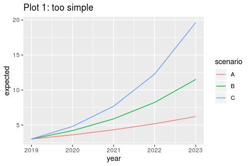
In the beginning we had this plot intended to inform management about future profits for a certain product under three scenarios A, B and C:
This plot is not telling the whole story as forecasts are fundamentally uncertain. That’s why I tried to include both a lower and an upper bound for each scenario’s prediction interval:
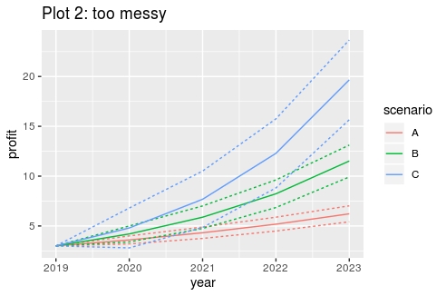
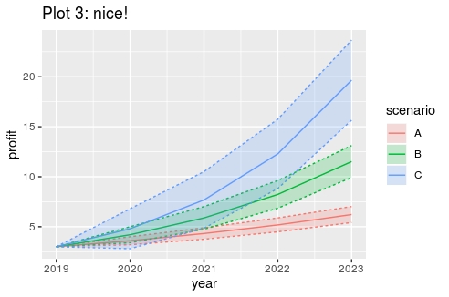
Nine lines in one plot makes things look kind of messy. Time has come to include some nice background colors like so:
The code
The code for creating these plots is as follows:
Some ggplot background: painting in layers
The tidyverse includes ggplot2 (“grammar of graphics”), a package for creating good-looking custom made plots, fit for presentation purposes. When you are constructing a plot with ggplot, see yourself as a painter creating a painting by accumulating 1 or more layers of paint – or in ggplot parlance – by accumulating 1 or more geometric objects (a.k.a. “geoms”). In each layer we map variables to a plot aesthetic, like color, size or shape of a point, line or area.
Returning to our example, we accumulate the following layers:
- Plot 1: coordinate system + layer for creating lines
- Plot 2: coordinate system + layer for creating (more) lines
- Plot 3: coordinate system + layer for creating (more) lines + layer for creating coloring areas
Furthermore, we have the following mappings:
- The coordinate system (“ggplot”) maps the variables x and y axis to the variables “year” and “profit”.
- The layer for creating lines (“geom_lines”) maps group to the variable ” line”, color to the variable “scenario” and linetype to a variable specifying whether the line reflects the expected value or the upper/lower bound.
- The layer for coloring the area between the lines (“geom_polygon”) maps the fill color to the variable “scenario”.
Creating good looking plots with ggplot requires some practice. The first step is almost always transforming the data you want to plot to the appropriate (long) format: basically the values you want to plot plus variables to be used for the mappings described above. Furthermore, coloring the area between the lines using the polygon geom, requires the data rows to be in the appropriate plot order, as specified by the df2 dataframe in the example code.