
In this post, we will convert a decent plot to a good plot.
A decent plot
This is how a decent plot often looks like in practice:
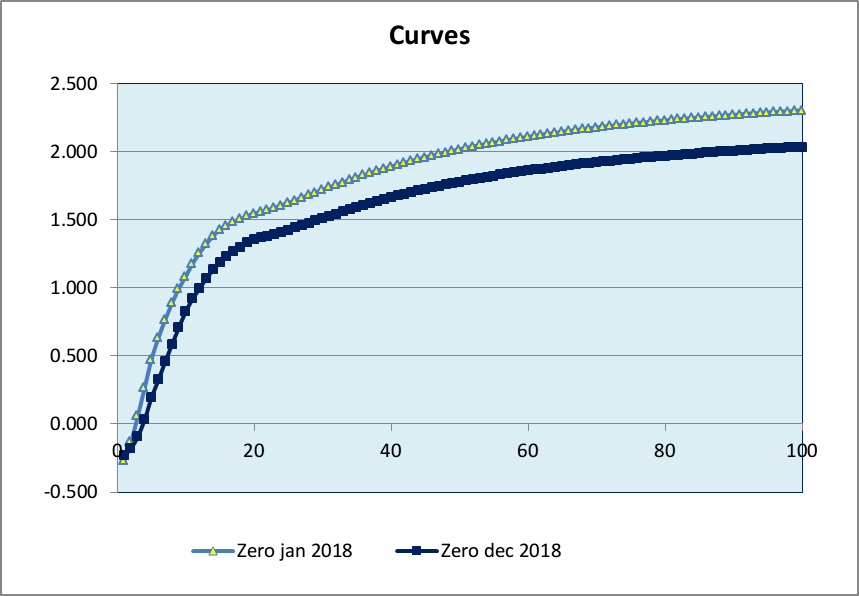
The objective of the creator of this plot was bringing the following message across:
“Because of decreasing intrest rates, pension funds had a hard time in 2018”.
At first sight, this plot seems rather straight forward and it does not look too bad either. However, I think there is still enough room for improvement if you want to upgrade this plot from “decent” to “good”.
These are my suggestions for improvement.
Missing information
- the title “curves” does not make much sense in this context; I prefer replacing this by a more informative title that expresses the message we want to bring across.
- the x-axis has no label
- the y-axis has no label
Redundant information
- the markers on the curve do not give additional information and can be discarded
- the y-axis tick labels contain two redundant decimals
- the outer box around the plot can be discarded
- the inner box around the plot can be reduced to the x-axis and the y-axis only
- the prefix “Zero” in the legend is the same for both curves, not very informative
Overall aesthetics
- for better readability, replace the legend by labels close to the curves
- arguably, blue curves on a blue background are not a good idea
- replace the solid grid lines with dotted grid lines
- include vertical grid lines for better comparison between curves at a specific year
- lowering the x-axis from 0% to -0.5% improves readability
- changing the color of the axes labels from black to grey puts more emphasis on the curves
From decent to good
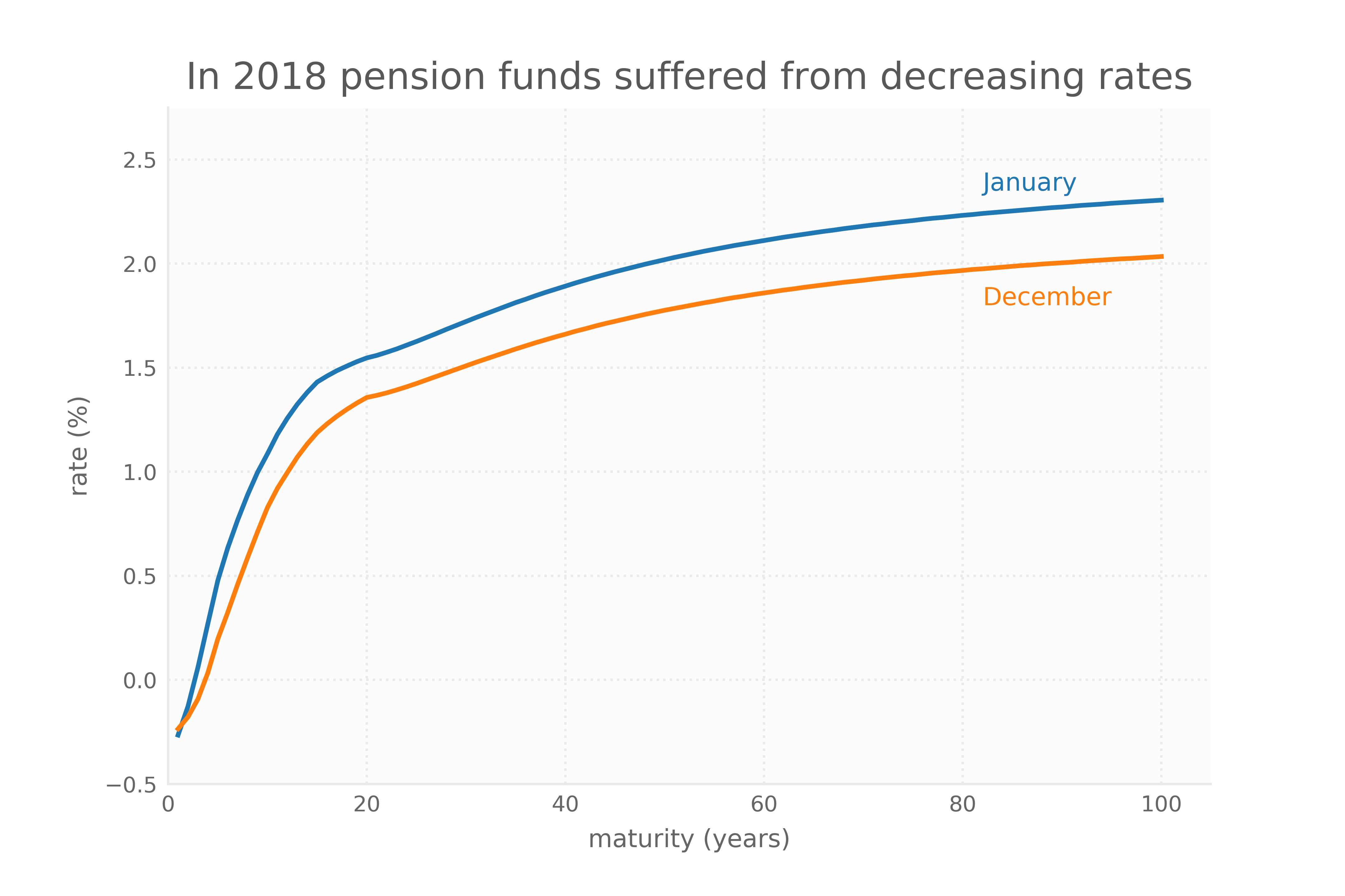
Here are both the old plot and the new plot right after each other. Compare & decide for yourself.
old plot:
new plot:
Implementation
The old plot was created with MS Excel. Of course, I could have created the new plot with MS Excel as well, but for better scalability, I wanted to create the new plot with matplotlib, the basic graphical library of Python.
Matplotlib offers several nice style sheets like ggplot and Nate Silver’s style fivethirtyeight. You can also create your own style, like the Tableau like style I created for this post, which basically overrides some of matplotlib’s parameter settings.
If you want to create line plots with a Tabelau look-and-feel yourself, these are the steps to make it work on your own system:
First, fire up your Python terminal to find out where the custom matplotlib stylesheets live on your system:
import matplotlib
matplotlib.get_configdir()
This will returns the directory for your custom style sheets, on my system /home/pieter/.config/matplotlib.
Second, make sure the directory found in step 1 contains a subdirectory named stylelib. If it does exist, you can continue to step 3. If not (like in my case), create the subdirectory stylelib first.
Third, copy the style sheet tableau.mplstyle to the stylelib directory you created in step 2.
Now you can start making plots using the new style like so:
import matplotlib.pyplot as plt
plt.style.use('tableau')
You can find the complete workbook for creating the new plot here.